Spring is peeking around the corner at us with a flirtatious smile. What better time to discuss fantastic outdoor spaces that allow us to break free from our winter indoor bound blues!
There is nothing better than sitting outside on a crisp evening by a fireplace watching the rhythmic dance of flames. Mid Century Modern architects knew this too because they incorporated multiple outdoor living areas in homes. They designed interiors and exteriors that were blurred together creating an alluring illusion that the outdoors live inside and the inside is an extension of the outdoors. It was and still is very common for a Mid Mod home to have multiple and separate outdoor living areas. It is this element of design that draws so many people toward the iconic Mid-Century Modern lifestyle. This type of architecture promoted a friendly community where people would congregate and socialize with each other in front and back yards. When I design outdoor living, it is important to remember these original principles of mid-century modern living that so many covet today.
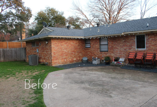
Anyone have a backyard that looks like this?

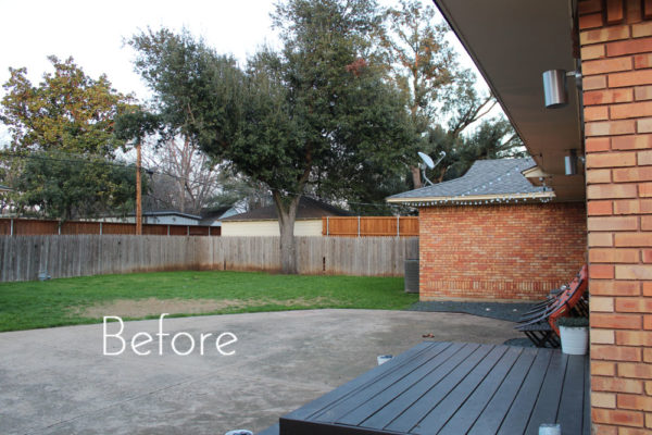
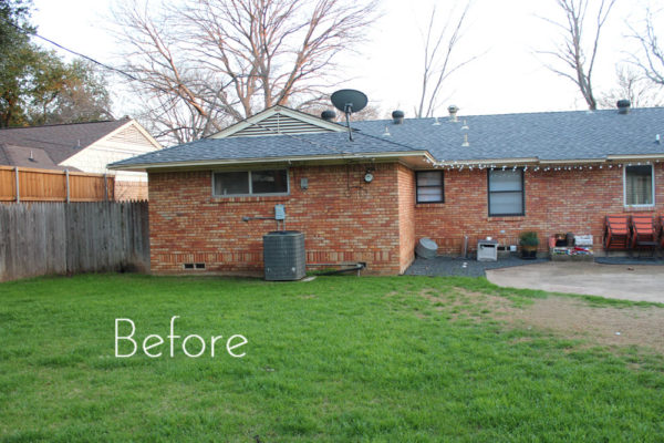
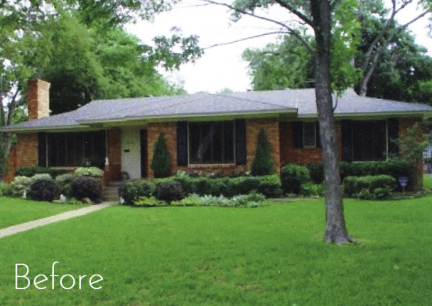
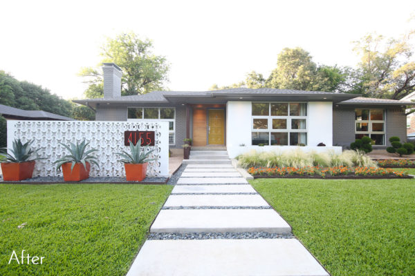
Well, I call this a blank canvas. A yard like this has unlimited potential but in its current state isn’t inviting at all. This home was a mid-century ranch that we remodeled with mid-century modern design criteria. Since the placement and footprint of the home did not lend itself to any side yard outdoor living, we needed to create front yard and back yard outdoor spaces that lived cohesively with the interior. Allowing for entertaining, socialization, and family events that cohesively extended beyond the wall of the actual home structure. If this is done properly the home will feel much bigger than the actual square footage and will have a feeling of warm, vibrant energy.
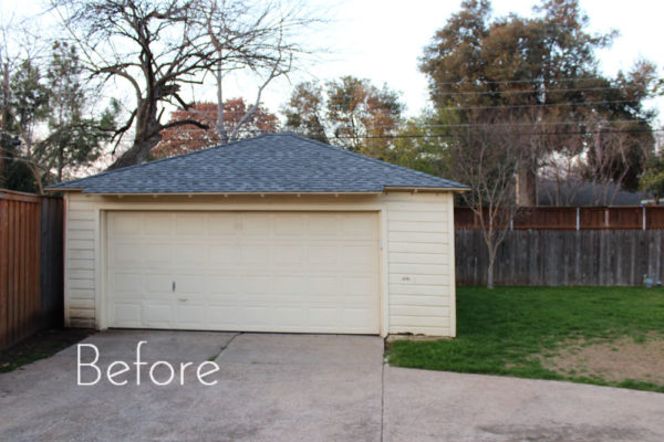
If you apply Mid Mod principles to this backyard there were two design challenges to overcome. The first is that when we painted the home and garage, everything was gray. And while I love gray, too much of one thing can be uninteresting. The second design challenge was that I had one large space to work with and if I kept it one level, it would have looked one dimensional. There would have been no separation in living spaces and would have been boring. Nobody buys boring!
To solve for these two issues, we installed a deck that wrapped around a “sunken” patio to create a space off of the master bedroom for lounging. I used a composite deck material which is durable and virtually maintenance free. But again, it was a darker shade of gray. To break up the gray, we poured a light concrete patio at ground level for the dining area and installed a modern shade pergola that we stained in a deep warm color. Because the patio was on a lower grade than the deck, it made each space feel like a separate room coexisting next to each other. The yard was sizable but not huge so I used an Ipe wood for the back fence to bring in a natural warm element into the space. (Ipe does need oiling every 12-18 months to maintain this rich color and will last more than 30 years). Since the fence was such a statement, there was no need to add a lot of landscape to distract from its beauty. Herb boxes were added to separate the yard from the driveway area. The herbs also provided beautiful aroma and many of the plants acted as natural mosquito repellant to the dining area.

Photo Credit: Shoot 2 Sell
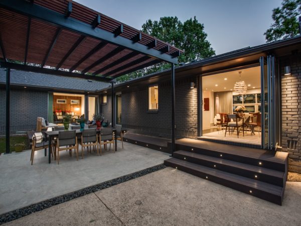
Photo Credit: Shoot 2 Sell
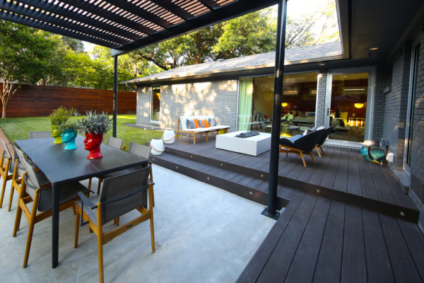
Photo Credit: Christine Colling
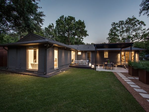
Photo Credit: Shoot 2 Sell

Photo Credit: Christine Colling
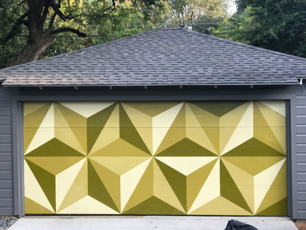
Photo Credit: Christine Colling
As with any room design, the construction is just part of the equation, the second and equally important aspect is furnishings. You always want your furnishings to showcase the design and be consistent with the style of the remainder of the home. In this case, I wanted a large dining table that would seat at least eight people. I wanted the firepit to be white to contrast with the dark gray decking material. I used furniture with Teak frames to bring more warm wood into the design. And lastly, I kept the furniture neutral and added color through the pillows and flower pots (which can be easily changed over time). After we were done with this project, I felt like something was missing. I kept looking at the white garage door and all I kept seeing was a large white canvas to paint on. An idea was born. The garage door mural was painted to serve as artwork to the backyard. When it was done, this backyard was ready for cookouts, birthday parties, and the occasional quiet night by the fire.
Outdoor living that is thoughtfully planned becomes an extension of the main living of any home. Studies show that well designed outdoor living increases the value of your home and is also extremely sought after by home buyers. As spring is around the corner, I hope this outdoor transformation provides you inspiration on how your outdoor space can become your future mod haven.

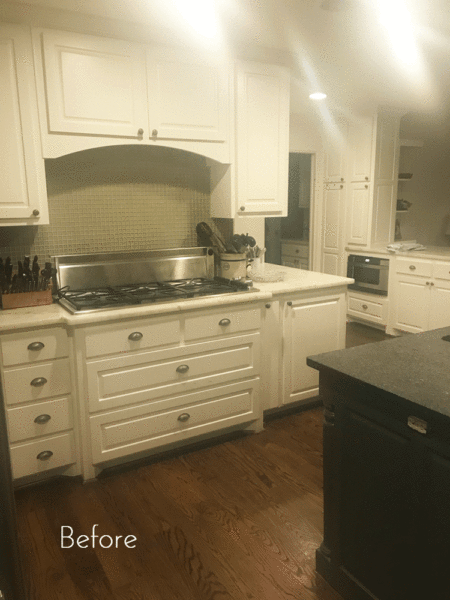

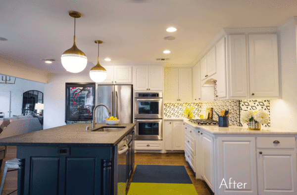
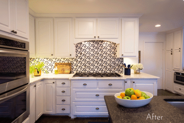


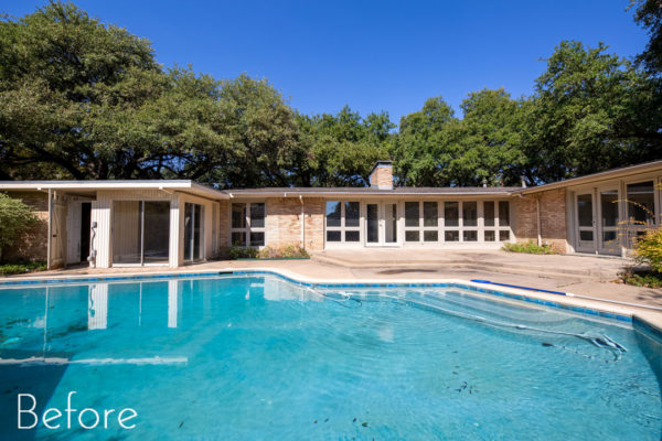
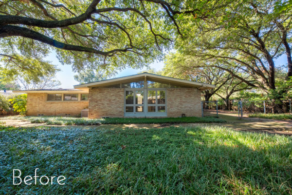
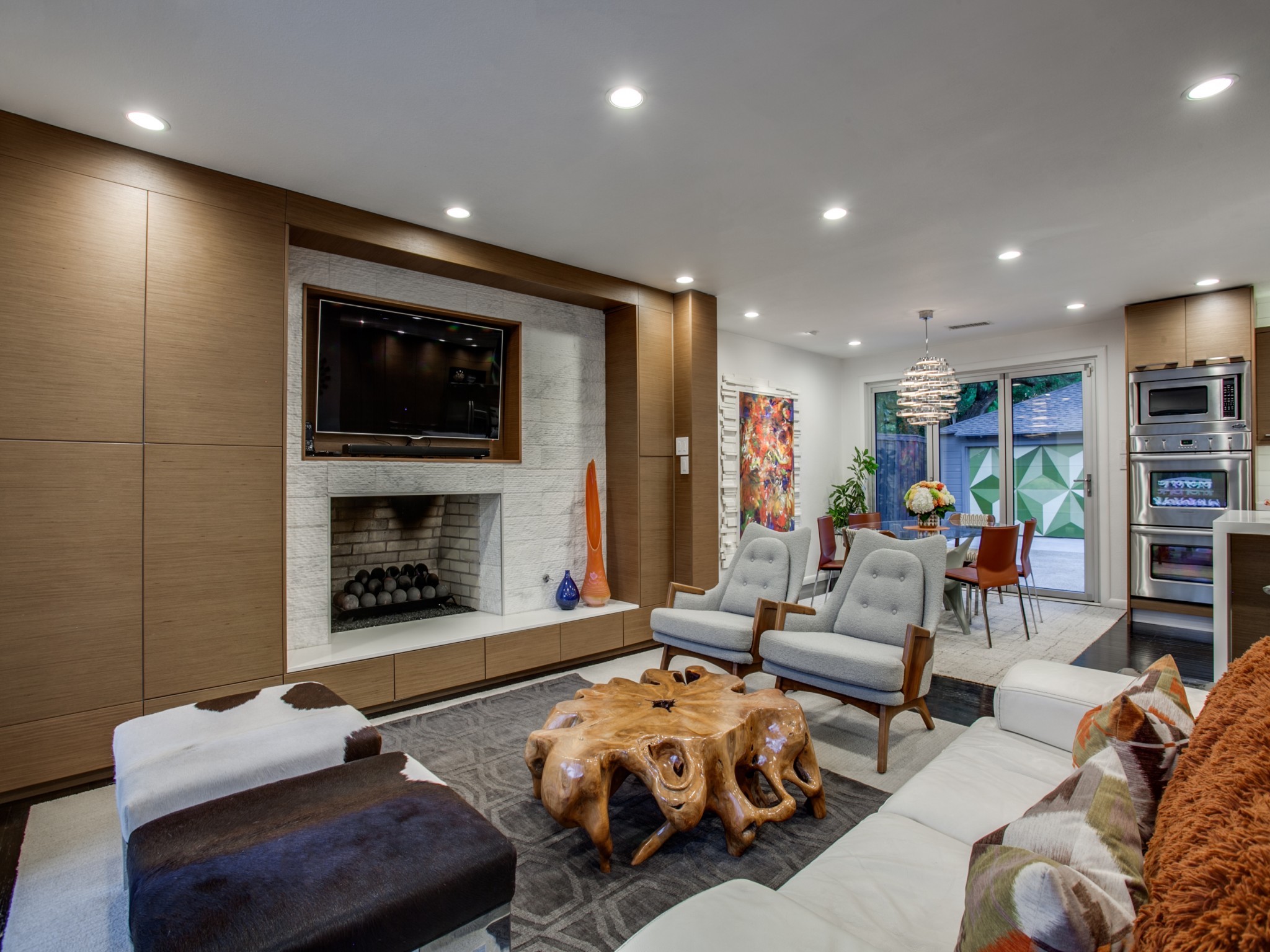 Photo Credit: Shoot 2 Sell